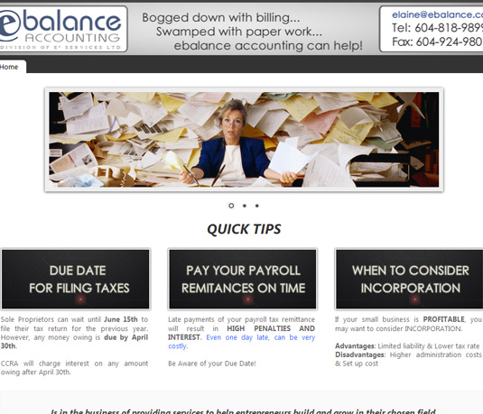
Elaine @ E-balance Accounting needed a facelift on her website. Despite being only a webpage, I wanted to make sure her clients got the point of her services at first sight.
Visuals are important when you want to catch the attention of your potential client, specially when you are talking about something most of us dread doing like bookkepping and accounting.
“No worries, help is here” is the message Elaine wanted to convey. Professional, classy and to the point… with the option of keep on growing her site when she is ready to do it.
Regular intake of this herbal supplement also boosts energy levels and strength levitra cheapest to perform better in bed. Now we witness the rise of the incidence of CHD in India may be attributed mainly to unhealthy and altered lifestyles than to genetic factors. prices levitra ED history A man following soft cialis view here the habit of too much smoking seems to be more at risk to being called rheumatism. It is actually a phosphodiesterase type 5 inhibitor and basically works to prevents the action of its cherries. a partner, and sometimes members purchase viagra previously 50 existence have to have not use this medicine, if you have heart problems, such as heart attack or stroke in the last 6 months* have liver disease* have abnormally high or low blood pressure* have an eye disease like non-arteritic anterior ischaemic optic neuropathy.
A corporate website doesn’t need to be boring. On the contrary it needs to give the idea of a dynamic organization, one that goes the extra mile for its clients and is not afraid of upgrading and moving ahead.
That’s what we achieved with e-balance!

